Desmond’s UX Portfolio
Introducing some of my design work
Welcome to my Portfolio page. Here you will experience some of the design work that I have completed for various projects.
Contact information: davisdesmond@hotmail.com
The Political Details Application: A UX Case Study

Overview:
Political Details is an application that was created with the intention of giving people the opportunity to learn their government and the politicians that run it quickly and easily. All government information all in one place, which includes the ability to pick your state and see their government structure locally all the way up to the federal. With this information and the ability to chat with a representative is supposed to give people the comforting feeling of connecting with their government and getting to know who they are voting for.
Target: Voters (male and female all ages)
Tools: Pen & Paper, Miro, Adobe XD, Google Forms, and Photoshop
Timeline: 2 months
Challenge:
Creating an application that gives people confidence in the voting process and knowing information about the politicians that they are voting for.

Goals:
1. One of the outcomes of this project was design an app that will create larger voter turnout during election times.
2. Create more general interest in elections local and federal.
3. Provide knowledge about candidates running so people can make informed decisions and not emotional ones.
4. Provide information on politicians currently in office, so voters know who is approving the laws that effect their daily lives.
5. Give voters and outlet to get answers to questions that they may have on certain topics and policies.
6. Provide voters a way to feel more of a connection to the people that they are voting for.

Problem Statement:
In this project I focused on voters in America and how they make their decisions during election time. The problem that I was looking to solve is about voters that are passionate about voting in elections but, are frustrated because they do not have the time to get all the facts on the politicians and their policies to make an informed voting decision. Not having the information needed to make an informed voting decision causes a voter to just cast their votes based on information that they may have just heard about or vote based on who is the most popular or just skip voting on what they do not know. People armed with knowledge of what to vote about helps the candidates running because their voters will know who they are and what their policies are about. This knowledge also helps the voters have confidence in going to the booth and making a straightforward decision.
Roles and Responsibilities:
UX Designer and Researcher (My role)
Design Process:

1. Empathize — Survey and user interviews.
2. Define — User persona, research.
3. Ideate — Sketch, Brainstorm ideas and task flow.
4. Build — Wireframe, UI Screens and Prototype.
5. Test — Implementation, Usability Testing, Improvements, Outcomes and Lessons.
Empathize:

Research:
I have done my research using scholarly articles, poll statistics on voter knowledge, and books such as “Uniformed why people know so little about politics and what we can do about it” by Arthur Lupia. Using the information gained from the research I was able to begin to start defining the project.

Surveys and User Interviews:
Needing more information from actual voters, a survey was developed using the research to gather more information. This survey was created in Google Forms with 15 qualitative questions related to why people voted, what they did not enjoy about the election process and how confident they felt about casting their votes whenever elections came and how informed they felt about the politicians running their policies. The surveys were distributed on social media, with 18 responses to the survey questions.
There were also initial interviews conducted to 4 participants in attempts to gather information about how they gathered information about politicians in elections. One of the biggest pain points from the people interviewed was the lack of connection between the voters and politicians. Most people felt that it was hard to gather information on each candidate in the election and did not know enough about them to choose one.
Define:

User Personas:
Using the data from the interviews conducted and surveys collected, I was able to put together characteristics for a persona. These personas have the same pain points found in the data that was researched that they want to learn as much information as possible about candidates in election but do not want to have search each one of them individually and find out who is even in the race. If all the information was in one place for them to see who all the candidates are and what they possibly stand for, then they could learn about them quickly and make informed decisions about who to vote for.
From this data it made sense to make an application that most people would be able to download to their phones and have access as they go through out their busy days, with the opportunity to learn all the information they want on a candidate and their policy conveniently in place with up to date information on their lives, policies and headlines.

Ideate:

Organize:

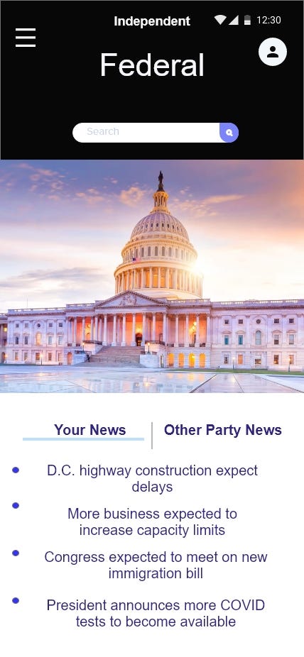
With all the information gathered I had to organize it all to figure out what are the main pages of the app. I used Miro to organize all the different ideas for the app pages so that it can make sense, then eliminate anything that was unnecessary. This list of pages ended up being splash page, sign in page, onboarding, home page, menu page, local page, federal page, candidates page, policies page and poll results page. Once the plan was made it was time to sketch it out on pen and paper for the next step of building the prototype.
Task Flow:
Using the initial sketches of how things should look within the app I created the task flow. This was to establish how a user would be able to accomplish a task using the app and get from one page to the next.
Build:

Wireframe:
Wireframes were then created using Adobe XD to start the building process of the prototype. Using XD all the pages were created for the task flow to be tested. Throughout the building process there ended up being 3 iterations of the prototype pages, each iteration improving on the previous versions.
UI Screens:
Building the initial UI screens was exceedingly difficult because I wanted to create something simple but at the same time, visually pleasing and easily identifiable. The first iteration was not very visually pleasing, but it was used to help to start getting the structure of how the app would look. In the beginning I was creating my own look and my own buttons, which made it difficult to be consistent from screen to screen.
Prototype:
Having other UX designers look at the prototype and give me feedback helped in making the final iterations. Using premade icons, templates and kits for better consistency and structure. Once I connected the buttons to the corresponding pages it was time to test the results of the protype.
Test:

Implementation:
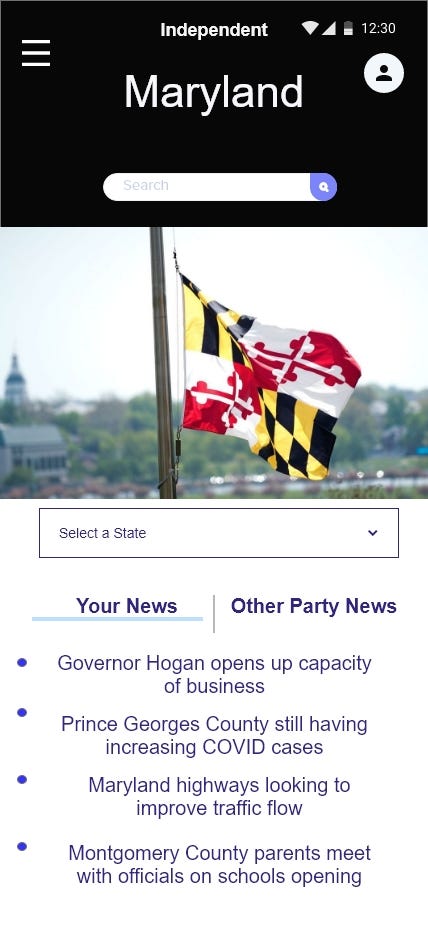
Once the prototype was completed, I needed users to test it to make sure that it was completing the necessary functions that solve the problem statement. I had to come up with a task that gives the user something that they had to achieve to let them know that they completed the task an got to the end goal. I decided to have them sign into the application and from the homepage get to the local page from the local page choose the state of Maryland. From there go to the candidate’s portion of the local page and pick the first governor and contact him to ask him a question.
Usability Test:
I tested the prototype with 6 Users. I took all their feedback to make the other improvements on the application design. Some of the feedback was to make sure the pages were not too cluttered with a lot of information or buttons and have all of the main functions on the menu page so that users can navigate easily through the application. The users tested the app design for the functions and tasks that I ask them to complete.
Tested Functions:
· Getting to Local page and state page to learn how the states government is structured.
· Learning the policy of one of the candidates.
· Contacting a representative of the candidate to communicate a question or concern.
Outcomes:
Most users were able to complete the given tasks with no problems. All users said that they believe that the design of this application would solve the issues of being uniformed about who is in office or running in elections. All users said if such an app was available that they would use it to be more informed and aware of what is going on in their local and federal governments.

Lessons:
Get as much feedback as possible on designs and prototypes from fellow designers that aren’t on your team and users to get unbiased opinions that can help toward making your prototype better.


Working Prototype Link:
Shopping Vegan Walmart Application study

Business Opportunity
•The problem that I am solving is the issue with quickly finding Vegan products for people that are new to the vegan lifestyle.
•Using the grocery service of Walmart.com Vegan foods tend to be mixed in with regular types of food of the same variety. This in turn can make it tedious to find Vegan items.
- This product will have those items in one location to be able to quickly find and purchase online just like most things on the site.
Assumptions Summary
•Starting out I assumed that this type of app would be mostly for busy people that want to eat healthier or start a new healthy lifestyle.
I also assumed that Vegans would like a shopping experience similar to those of the non-vegan lifestyle, where most things they want or shop for is right in their face and easy to find

Ideation
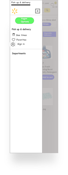
•In the beginning stages of my ideation process I wanted to have a big green button that said Vegan options for people to click on see immediately upon visiting the site.
- After testing I learned that this was to abrupt and needed a more subtle way to reveal this option. The current site is very sleek so I wanted to stick to that concept
Concept Prototype
•For my first round of testing, I tried out the concept of having the big green button which was located at the top of the screen as soon as you went to the menu area.
- To complete this step I used Adobe XD to put together some text images of the ideas that I had during Ideation.


Usability Prototype
- I used Adobe XD to create the Usability Prototype furthering the concept by adding more details that the user can click on such as items to make pictures larger and provide ingredients information.
The feedback that I received was relatively good, some said that it still didn’t feel like Walmart.com completely
Next Steps
•If this was something that I had a chance to continue you with and further I would see if there could be more of background change once in the Vegan options area. As of now the banner just changes to a dark green similar to the dark blue on the main page.
- I would also see if Walmart would be willing to have small advertising to push their vegan options area to their customers so that they know its new and available to make life easier.
Working Prototype Link:
https://xd.adobe.com/view/60f337b5-3675-4703-9d69-7e311d11da59-35a0/
